Colour – What Is It Good For?

Our world is full of colour, we can’t survive without colour. Colour is used for identification, safety, communication, emotion, emphasis – and above all, to make us feel happy. Living in a black and white world would require quantum changes to our system of life. Traffic lights? Shipping signals? Love hearts? Marking homework? Literally what would we do if we didn’t have colour?
Even people like me who love black and white, can’t survive without colour – we need it to stimulate our senses and to energise us. Colour can also calm us, enrage us, soothe us and frighten us. It is a pretty powerful medium that in itself is a compete science. It is fascinating and also challenging. When it comes to putting colours together in your home it can come a close second to speaking in public – a daunting prospect that many people either shy away from or try and ignore, or worse still, stay in the safe zone for fear of stuffing it up completely.
I recently visited a house that was beautifully furnished and appointed, but the owners had clearly been afraid of moving out of the monochromatic scheme that they had started. What happens is nothing – there is not a lot of stimulation, nor is there any room to move. If you stick with one colour and continually add things in that same colour it has almost the same effect as an all-beige on beige colour scheme – it is boring.
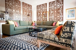
There are many “remedies” for colour boredom, not all have to do with adding contrasts (total opposites on the colour wheel, e.g. blue is opposite to orange). Having said that, adding a contrast is one quick way of introducing interest, remembering to keep one colour choice dominant. A case in point, imagine an all-blue colour scheme, blue walls, blue sofas, blue rug – now throw in a bright orange cushion – you get the picture.
There is nothing wrong with a completely neutral scheme (colours that don’t favour one of the primaries) but to keep things interesting, textural interest has been be added to keep things alive, with extras such as living plants or flowers, mirrors and plenty of natural light (which will change the tones of neutrals throughout the day, thereby changing the colours).
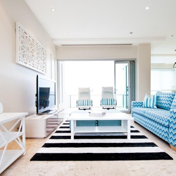
Getting back to black and white – very hip, but maddeningly predictable unless you can break the monotony by throwing in the odd extra colour – luckily this can be virtually any colour, from bright green to pale pink.
One of the hardest colours to get right, in decorating terms anyway, is yellow. Most people who have attempted to paint a room yellow will be rolling their eyes right now, nodding knowingly, remembering the surprising, sometimes horrific results of what looked pretty darned good in the paint shop on the colour chart. Yellow, for some crazy reason is also very tricky to match up with other colours, especially other yellows! All I can say about this is – get some professional advice. I have seen most yellow disasters and could steer you away from that Hitchcock moment of seeing the freakish result of the Wrong Choice. Most good professional painters have also seen everything there is to be seen in people’s colour disasters, so please, please ask for professional help – that’s why it is called professional help!